Sorta Digital (Artifactual)
Rosbitt Gonzalez
Sorta Digital (Artifactual) began as a semester-long exploration into how digital typography could change through use and interaction, similar to what is observed with physical type, through a form of artificial degradation to develop unique characteristics and style through procedural generation. Inspired by the physical wear found on traditional wood and lead type letters, this project challenges the perfect appearance in typeface design.
Artifactual explores digital typography’s capacity to be influenced by procedural algorithms and data, demonstrating that even as a digital product, algorithmic degradation can create organic visual character.
Exhibition

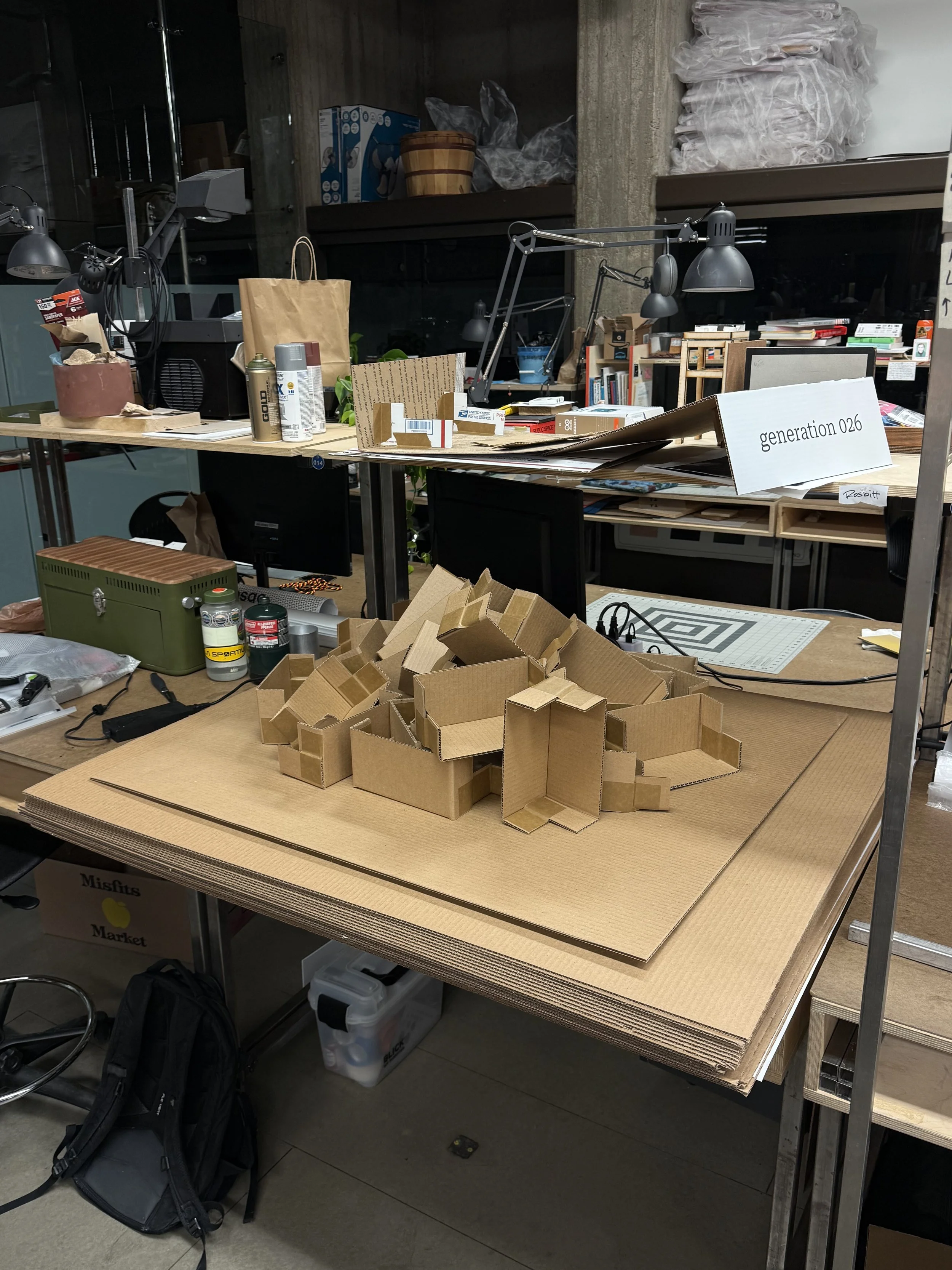
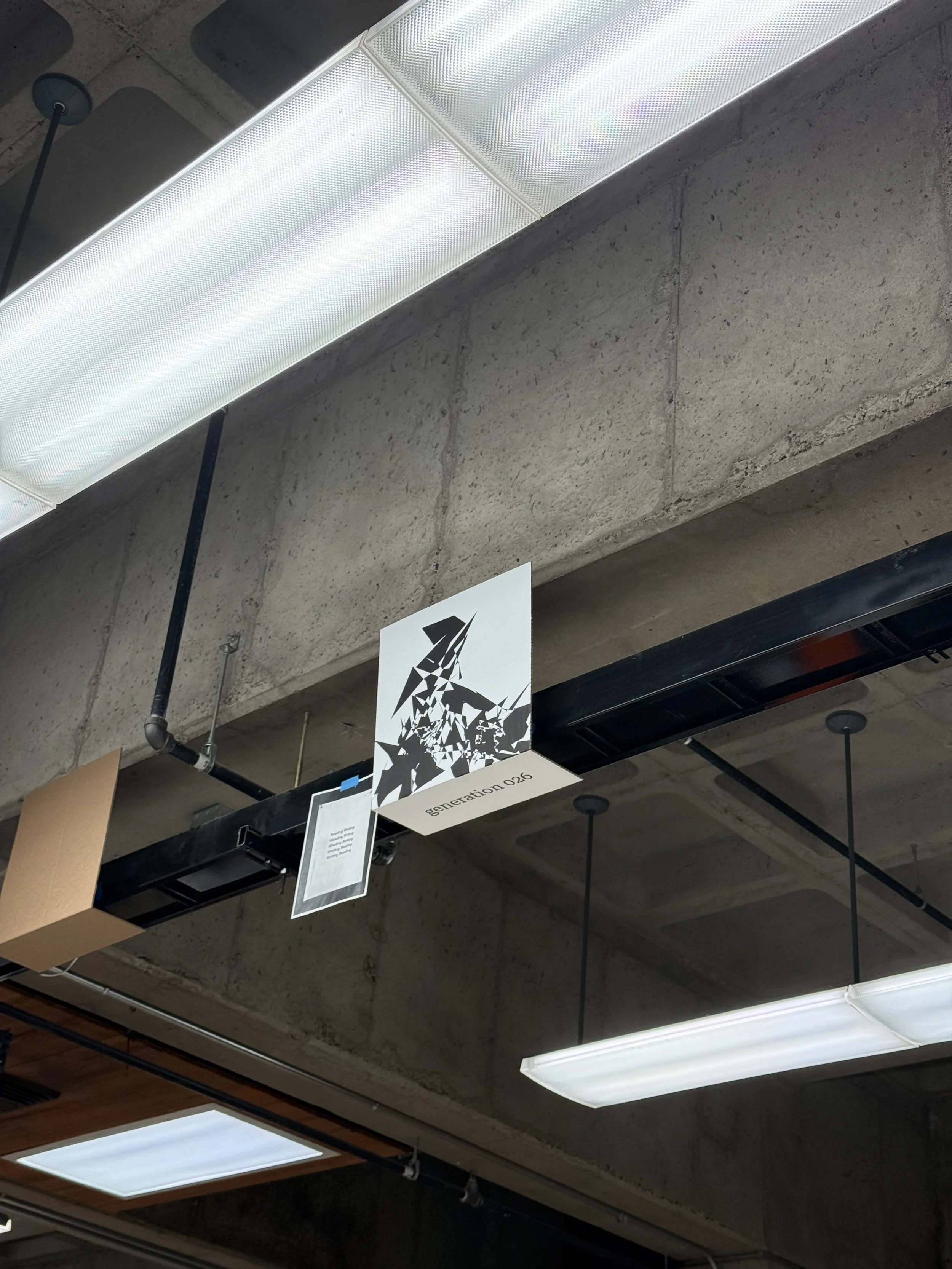
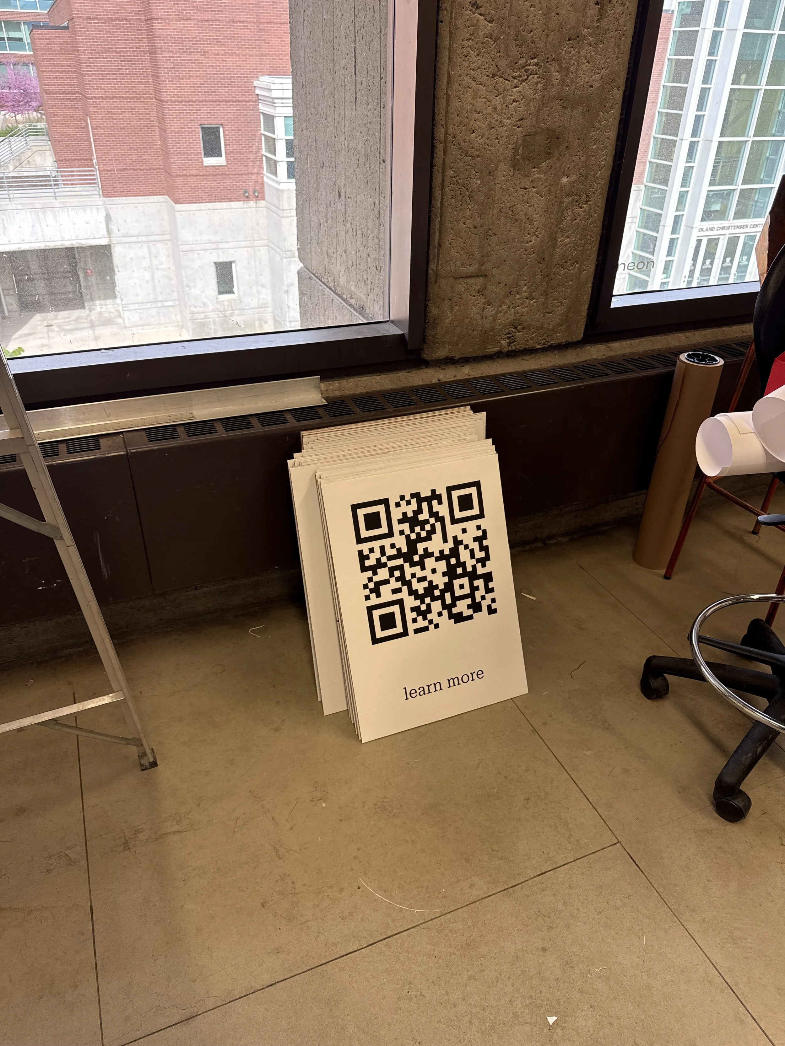
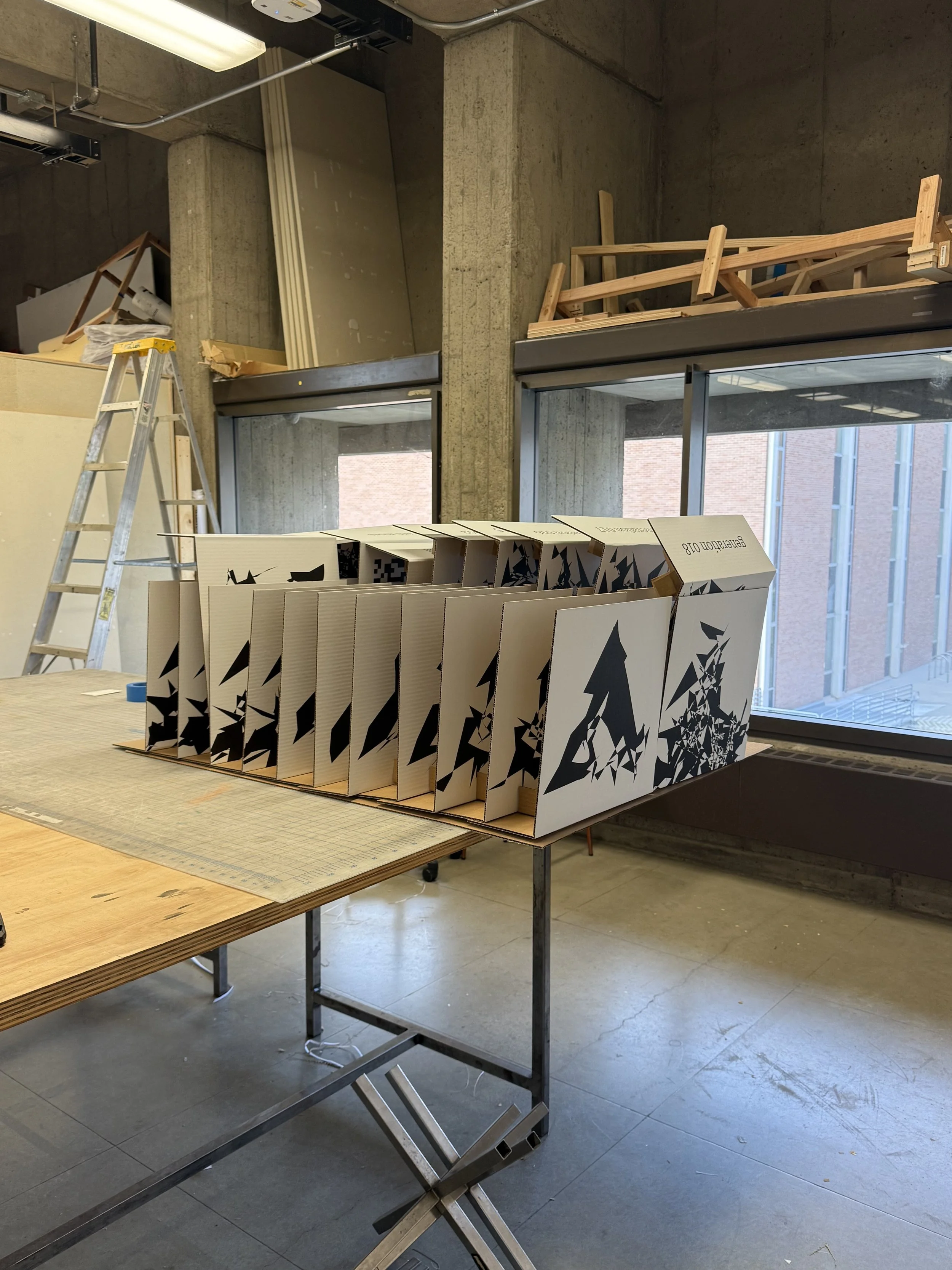
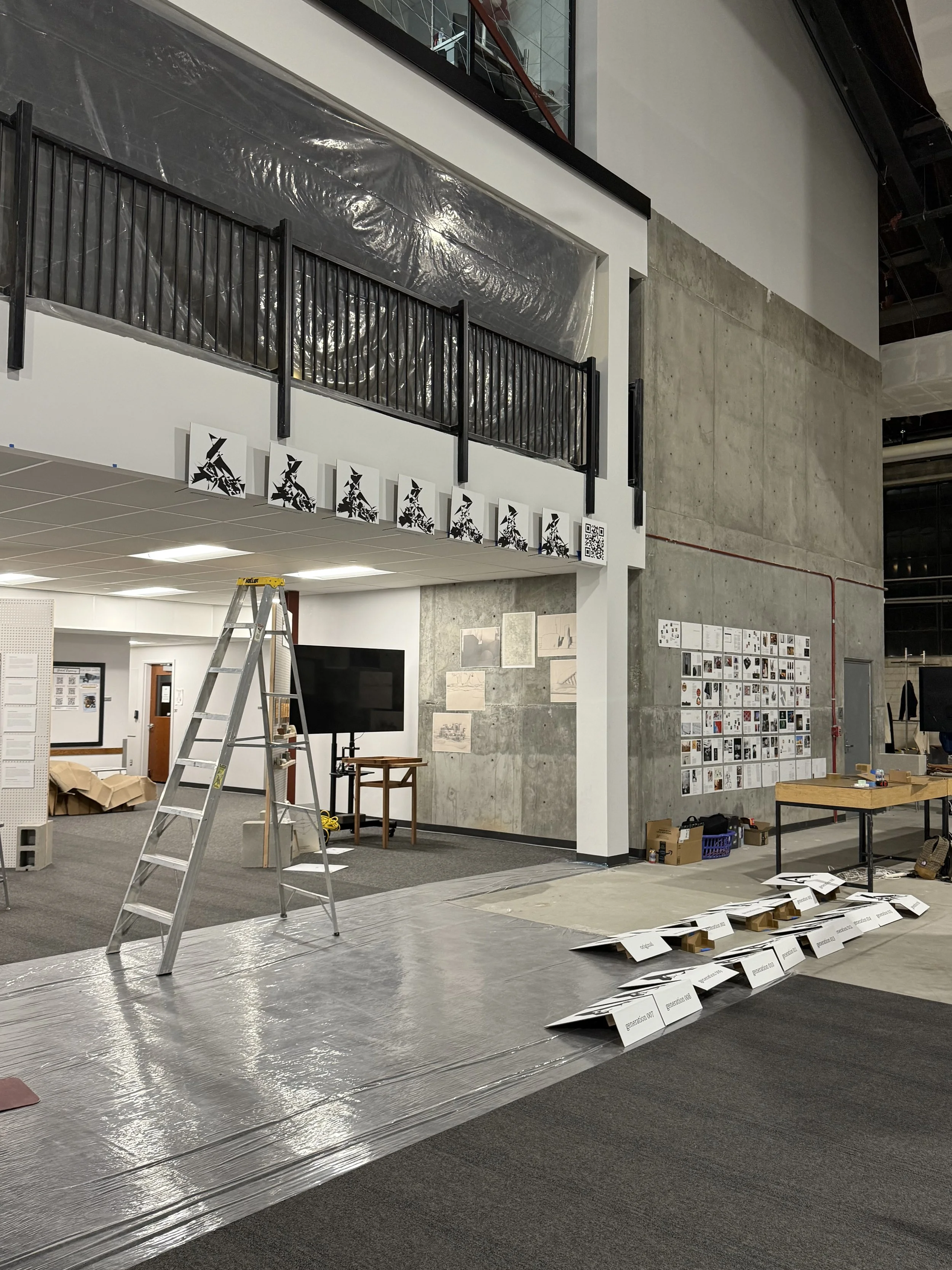
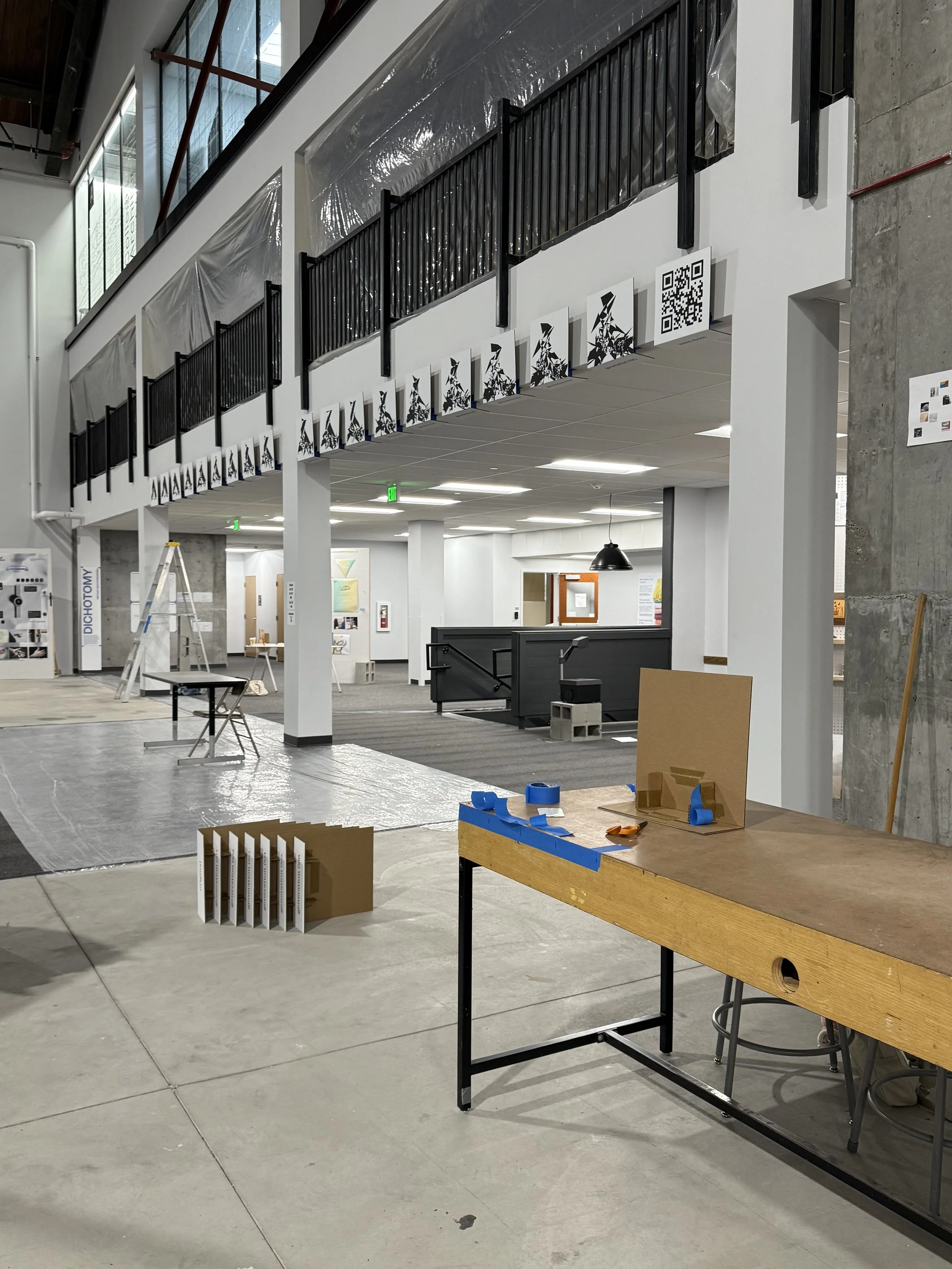
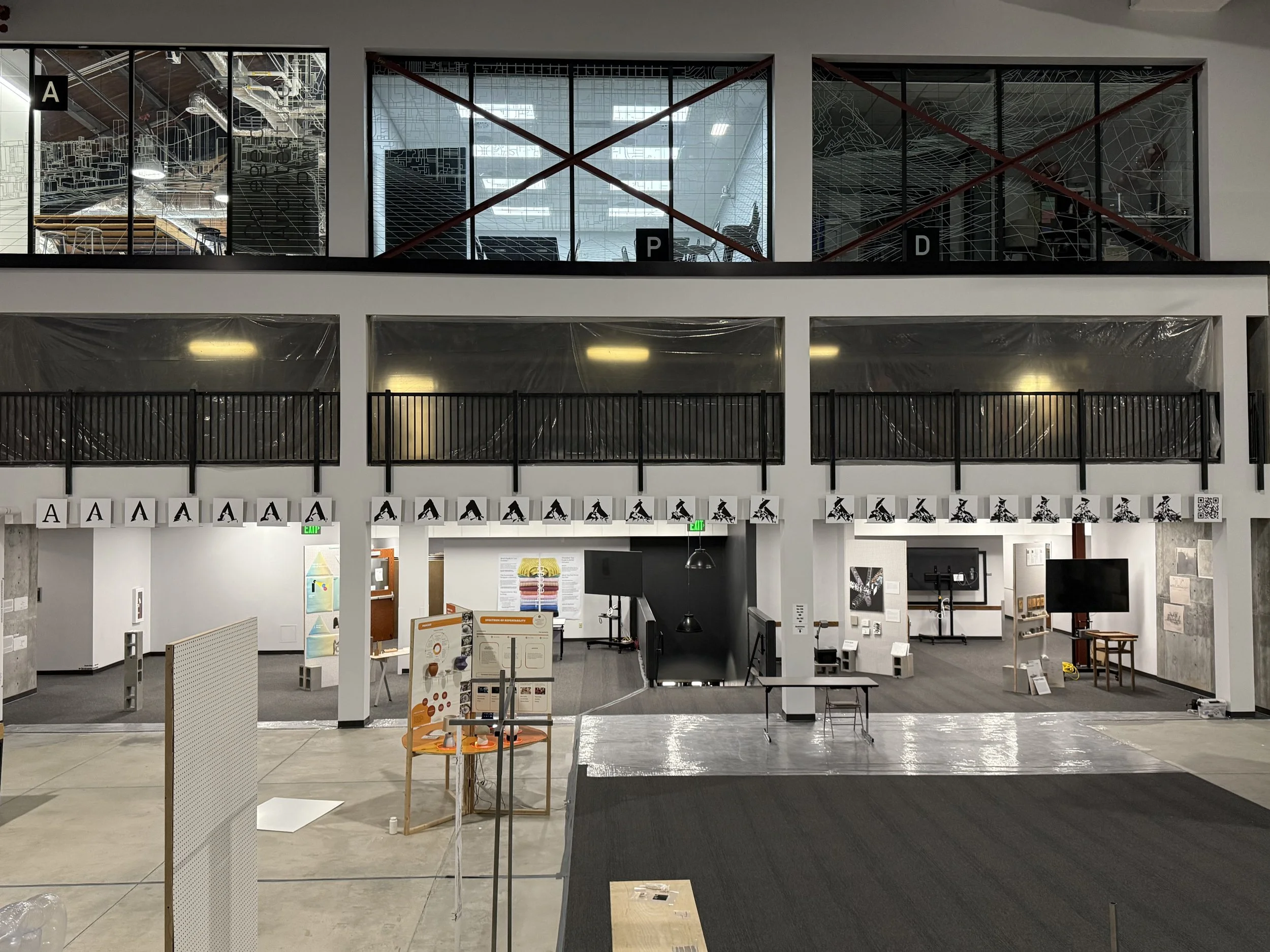
The work displayed at the 2025 University of Utah Senior Design Exhibition ("Senior Show") showcases the original typeface, Roboto Serif (Regular), alongside 25 progressive generations of the letter "A" produced using an early version of one of four digital degradation algorithms I prototyped with. This visual progression reveals distinctive the digital wear patterns created as the font evolves through algorithmic manipulation, demonstrating how the transformations can become a form of visual storytelling.
Development
The idea behind Artifactual came from a fascination with typography and its evolving history, particularly with physical type and relief printing processes, and the transition from these physical typesets to digital. As the industry shifted toward digital typography, physical typefaces were translated into their digital counterparts and designers were encouraged not to deviate from their original designs. Perfect translation was key, as the long-standing histories of these typefaces had already established their recognition and legibility. This emphasis on purity meant referencing only the cleanest letterform examples and avoiding any examples of wear and imperfections. However, this pursuit of perfection effectively erased the character physical type adopted through its repeated use.
By contrast, traditional printers who continued to use physical lettersets found that, as their letters wore down, the resulting imperfections gave their prints a unique identity based on letter and print quality. Each set of type told a story through its flaws. Rather than viewing this wear as a defect, Artifactual celebrates degradation as an integral part of typography that provides character and historical depth.
Initially, I envisioned creating a font system that would function like a passed-down set of physical letters; each download would act as a transfer of that set, producing a unique version of the typeface that degrades linearly with each subsequent download. Early adopters would receive a pristine copy, while later users would get increasingly degraded, potentially less legible, versions.
As the project evolved, my focus shifted toward designing an algorithm that could mimic the wear patterns observed in physical type. My research led me to identify three key variables that give traditional letterpress its distinctive character: ink coverage, pressure application, and use-related degradation marks. The unique combinations of these elements is what historically became signatures of a printer's craft, forming the foundation for my initial experiments.
Through feedback and continued exploration, the concept expanded beyond merely mimicking physical wear to creating a series of designed algorithms, each applying distinct effects to entire typefaces. These could simulate natural physical decay, use data-informed manipulations (such as effects tied to a user's geolocation or local weather), or introduce variable wear based on a user's character usage patterns. Future phases aim to explore these additional algorithmic possibilities.
Process
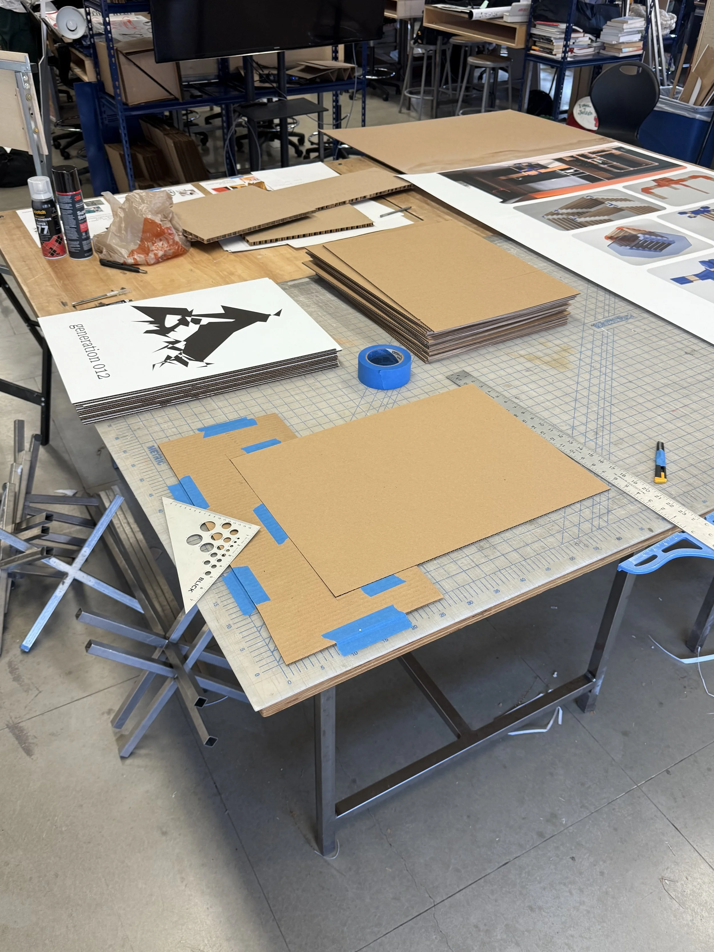
Using the Glyphs 3 font editor’s integrated Python API, I created four distinct algorithms that manipulate different aspects of the letterform’s construction. These algorithms work by directly altering the font files by targeting the mathematical data that define each character, specifically the paths, nodes, and Bézier handles behind each shape. Each algorithm uses unique parameters to create the different wear patterns: some introduce random node placements and movement, others adjust Bézier curves, and some remove existing elements entirely.
Developing of each algorithm required multiple rounds of experimentation, testing and parameter refinement to ensure consistency and avoid error down the generational line. With each algorithmic iteration, calculated imperfections are introduced, creating the organic, progressive degradation of each letter form while maintaining readability.
Applications
Artifactual represents just the beginning of the exploration into digital type decay. Future developments include the release of a refined collection of algorithms, a custom typeface designed specifically for use alongside these algorithms, and an interactive web tool that allows visitors to download the next generation of a typeface processed through a selected algorithm.
This approach reimagines typography as a living system capable of displaying information beyond the written text through visual transformation. Artifactual could be integrated with real-time datasets to create user-specific, region-dependent, or time-sensitive typographic experiences. Additional applications could include web implementations where text gradually transforms as users interact with content, or installations where the typography responds to data from the surrounding environment such as the temperature, humidity, or ambient sound. Challenging the traditional expectations of what digital type can communicate and how it can adapt to its environment.